Dev-log-ClockRoom
- Billy
The scene with a giant clock
Setting:
The group had decided pretty early to center the theme around the psychic of an autistic individual and render out the inner space with our own artistic renditions.
Considering our current unity proficiency, and the overall delicate subject we’ve chosen, we decided to keep the art direction towards the abstract side.
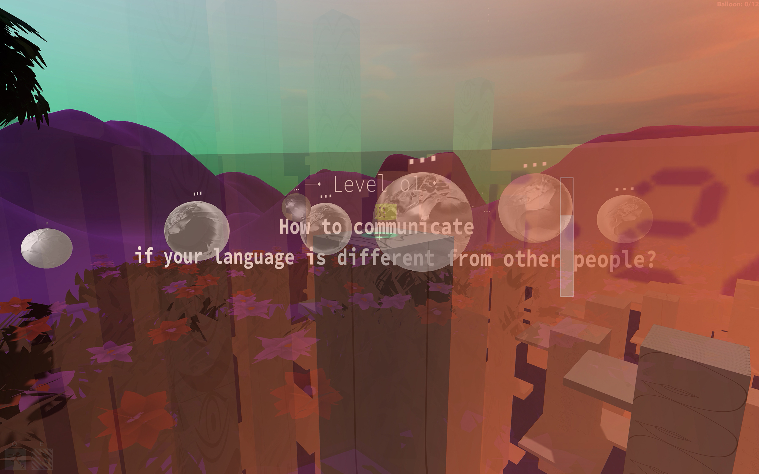
We’ve first come up with two groups of spaces, each revolving around its token: Balloon room and clock room. Serve as a representation of ways our subject navigates through daily interactions. The clock room represents autistic individuals’ fixation on patterns. Furthermore, the action of collecting small clocks adds to the idea of how consistent patterns help them navigate vocal dialogs.
As for the look and feel for the orange clock room, giving the introspective nature of our theme, I set out to create a place that is situated in the middle of nowhere, in-between places. I have always loved the retro brutalist visions of the future, a canceled future. Taking inspiration from Roger Deakins and the 2009s Australian dust storm, I tried to recreate the same deserted feel to it, invoking alienation and ghost-like being.
3D-Platforms:
Form:
I first prototyped the white building-like structures(I’ll refer to them as bricks from now on) without prefabs, given that we wanted to include randomized sub-platforms growing out from the side of the bricks. After a discussion with Roy, we realized the possibility of building a script that helps us procedurally generate different shapes of bricks attached to the main bricks. We ended up ditching that idea in order to better fine-tune our final user experiences. The final method we went for is to prefab the main brick itself, and hand curate the sub-platforms as children with players' movement in mind.
Movement:
I never really got used to working with transforms before this project, and I made a conscious effort to avoid that again in the beginning, I first prototyped the bricks movements with animations, only to find out later that the animations are hard-coded to set position coordinates, making the whole level unable to be adjusted. That’s when I finally sat down and look at the transform itself and created the final version.
Brick-Textures:
A big part of this room is the inclusion of human facial expressions, a very literal manifestation of autistic individuals' focus on details. Given the short time frame, I failed to resolve the tiling issue, so in the current version of our build, the tiles are not properly rated.
Atmosphere and fog:
Since the dust is a major part of the level, the first thing I thought of is the default fog component under the rendering’s lighting settings. It was not optimal, however, often getting only the silhouette from the objects, nonetheless, I changed the distance parameters from linear to exponential, though from the names it doesn’t seem to be going to the direction I’d want to, yet the results smoothed to the intensity and yielded a more intuitive effect.
Future Works:
Since my role within this project has been focusing on level design, I’d need to present a more polished look to the game objects, essentially not making the game world too “empty-like”.
Get MY AUTISTIC SELF | A Walking Simulator Game
MY AUTISTIC SELF | A Walking Simulator Game
This is a game focusing on the autism.
| Status | Prototype |
| Authors | royyang, binnalee, chooseimage |
| Genre | Role Playing |
| Tags | 3D, autism, Unity, Walking simulator |

Leave a comment
Log in with itch.io to leave a comment.